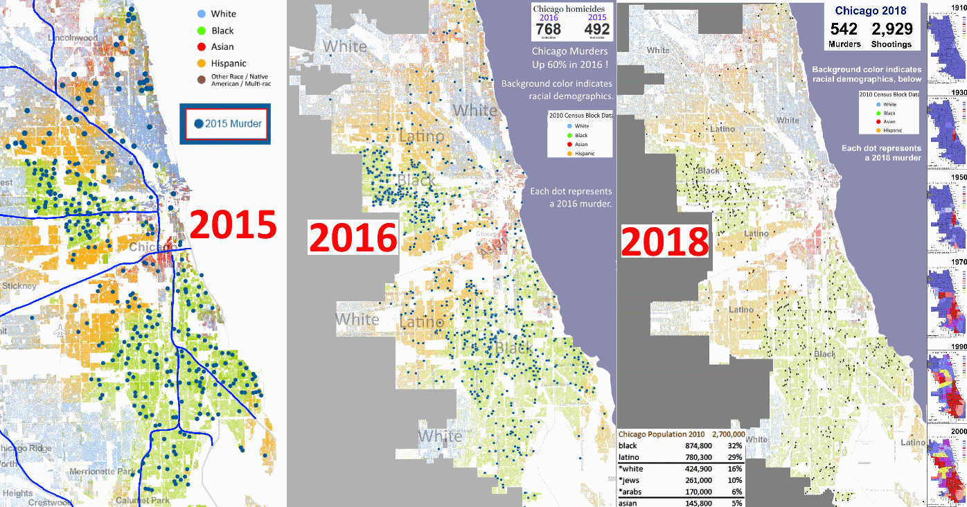
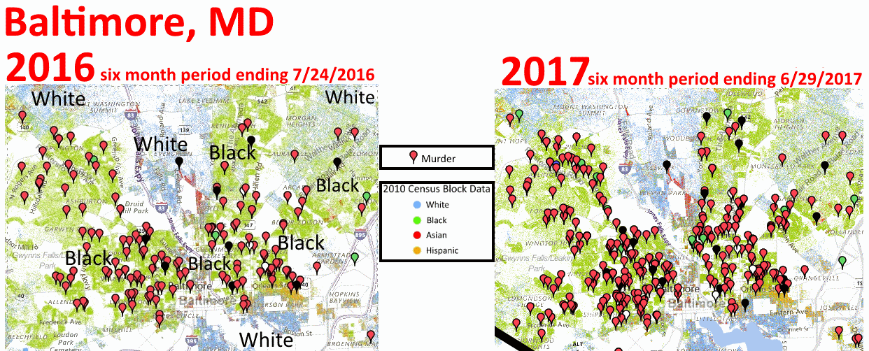
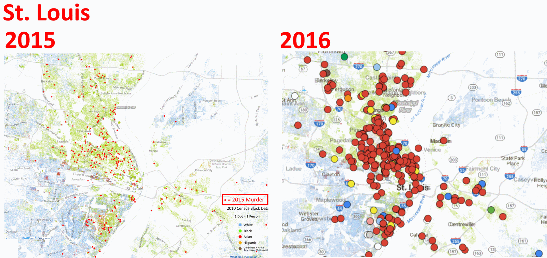
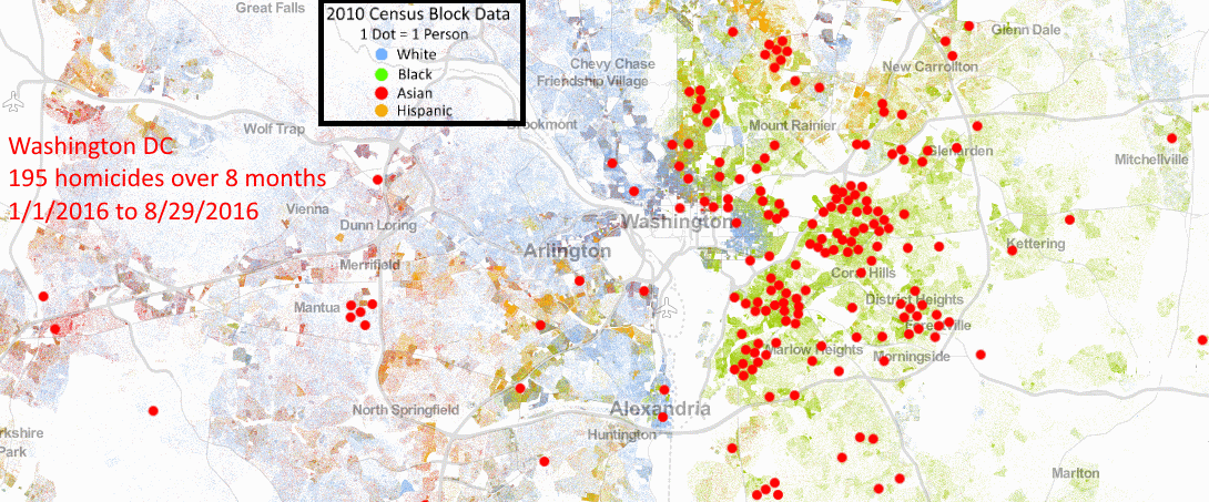
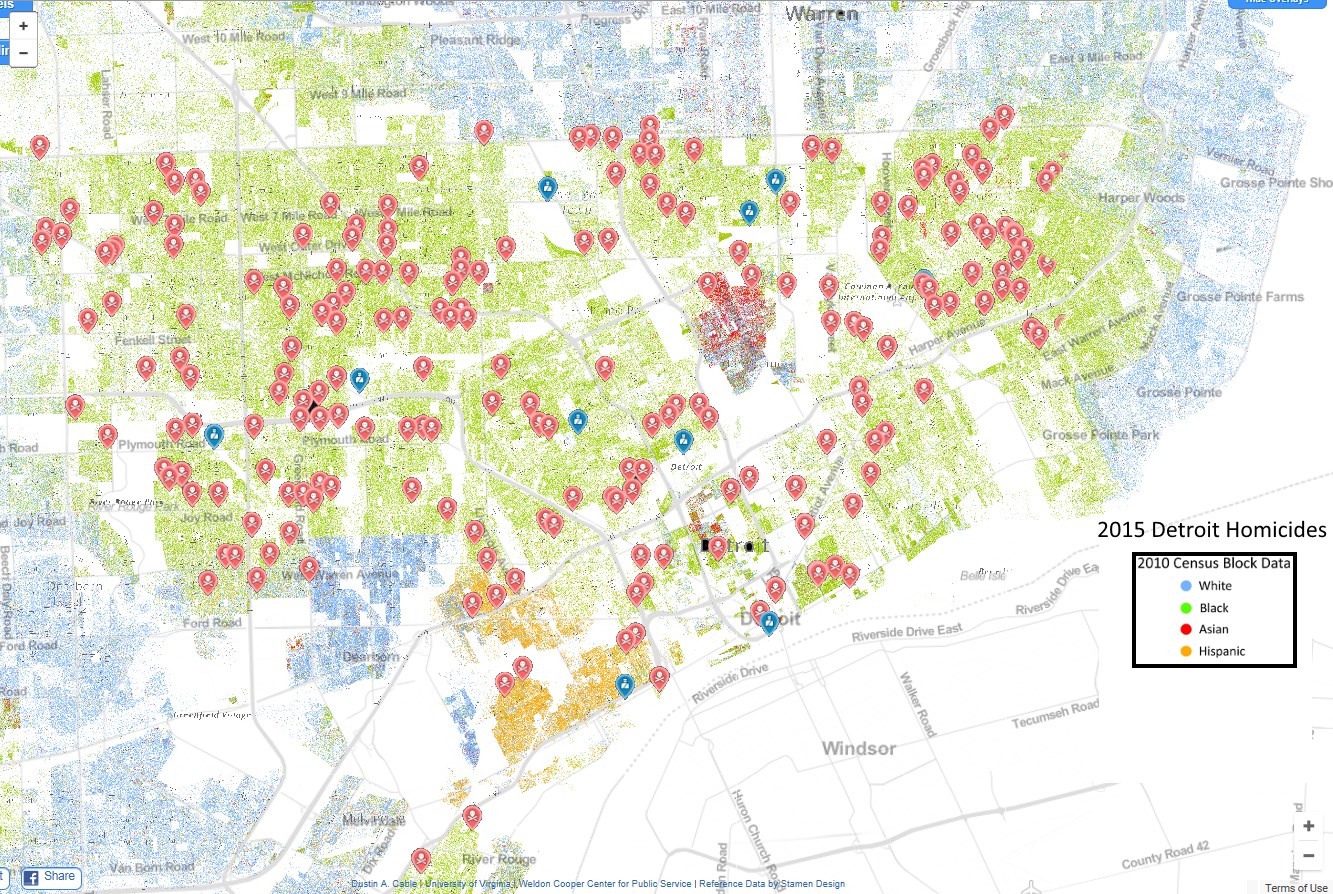
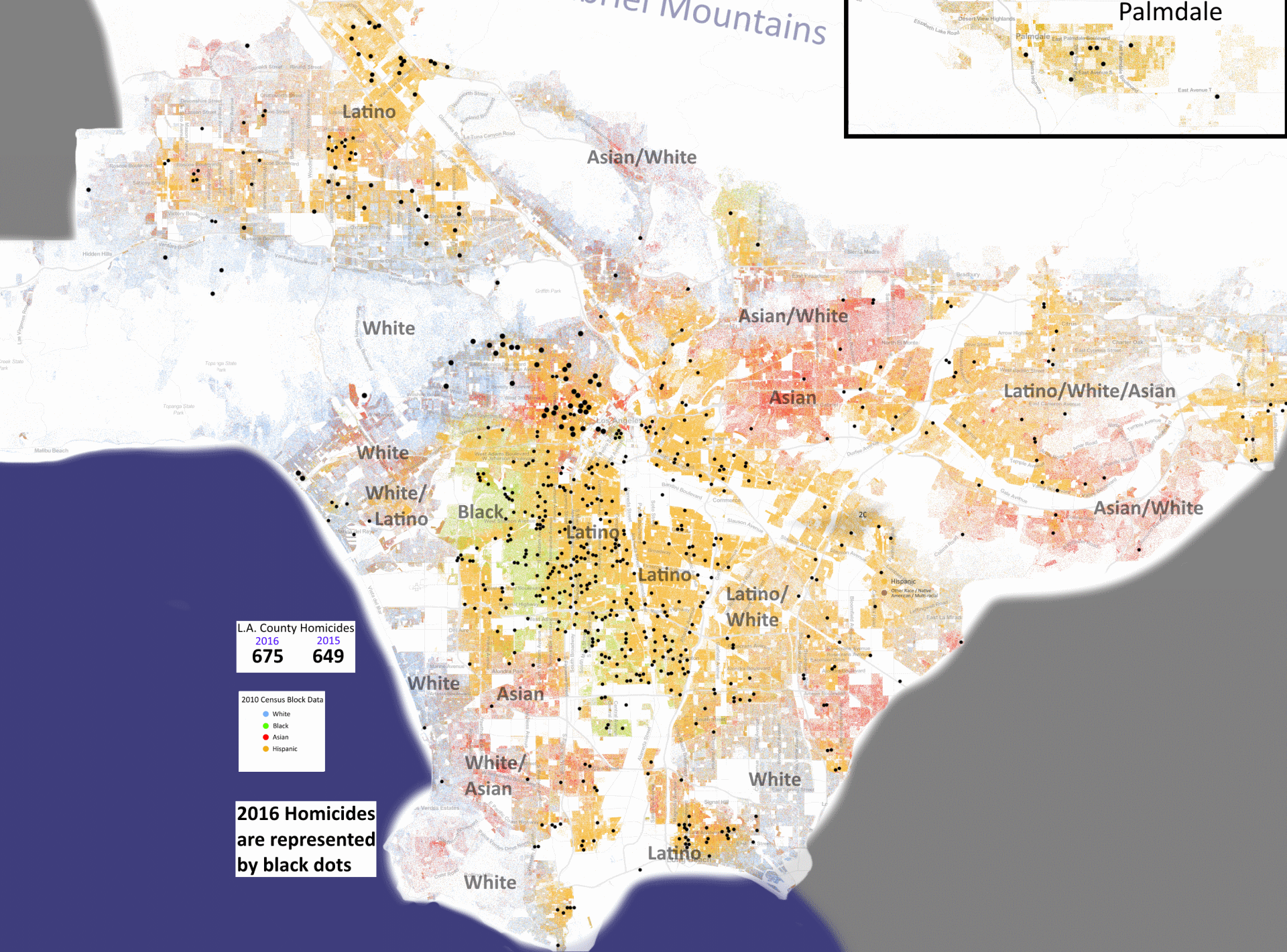
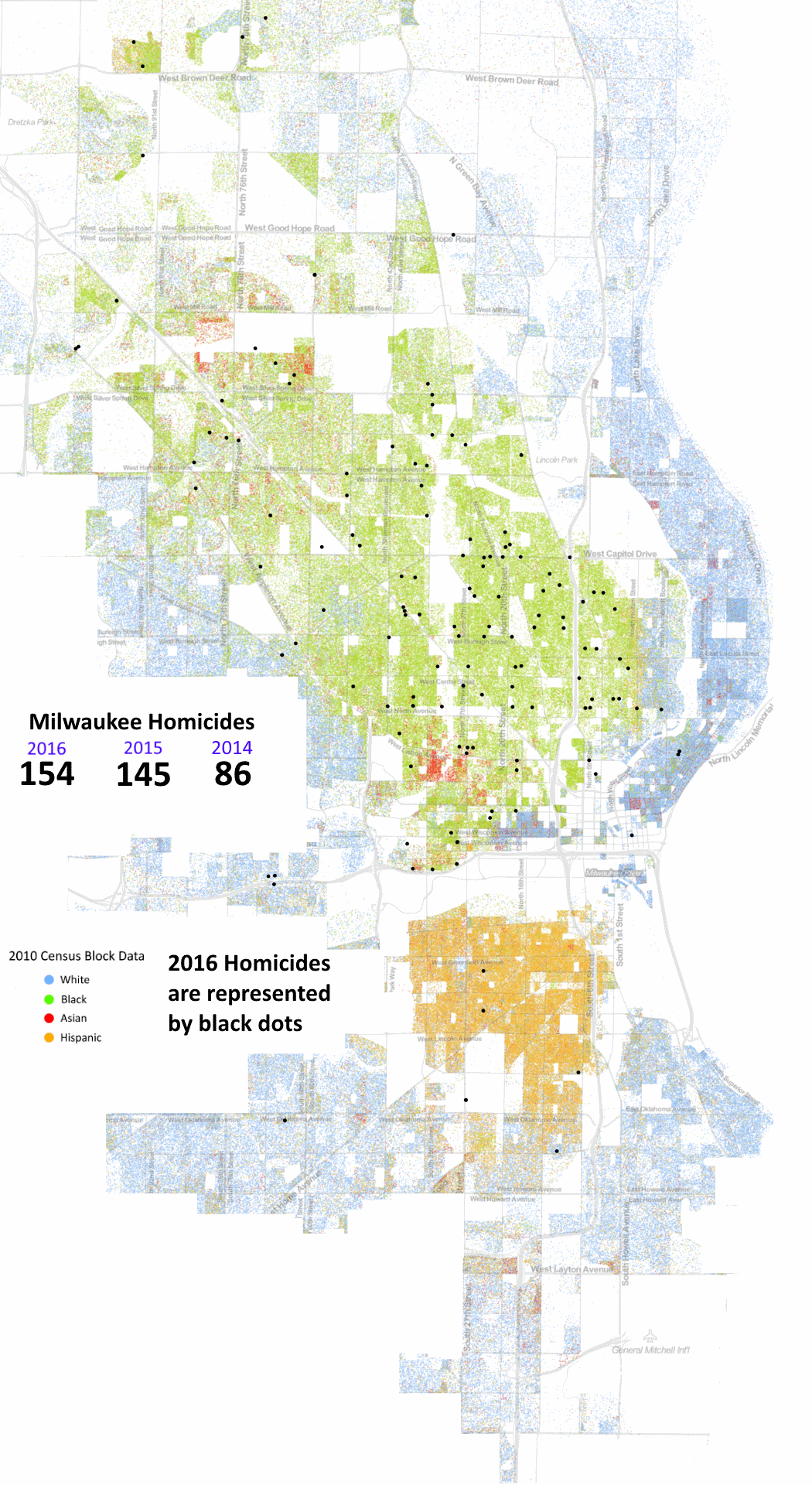
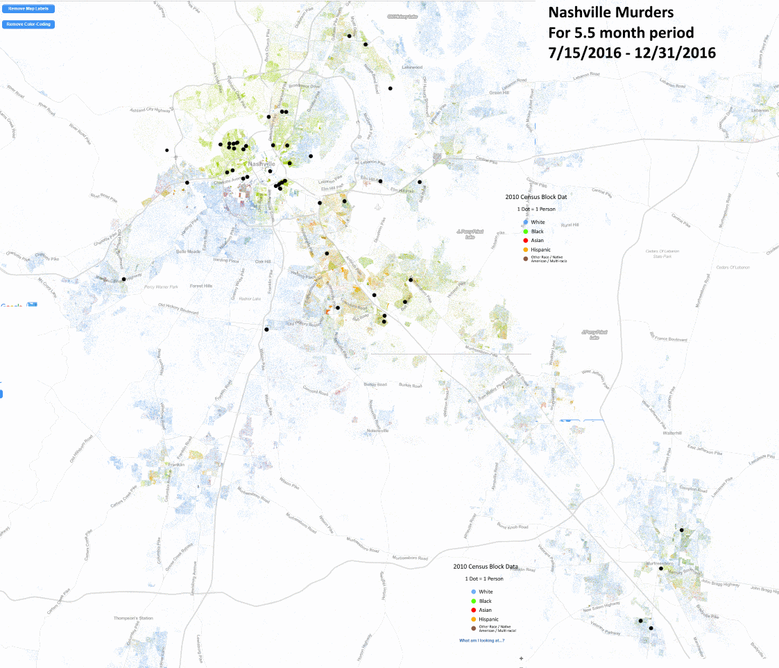
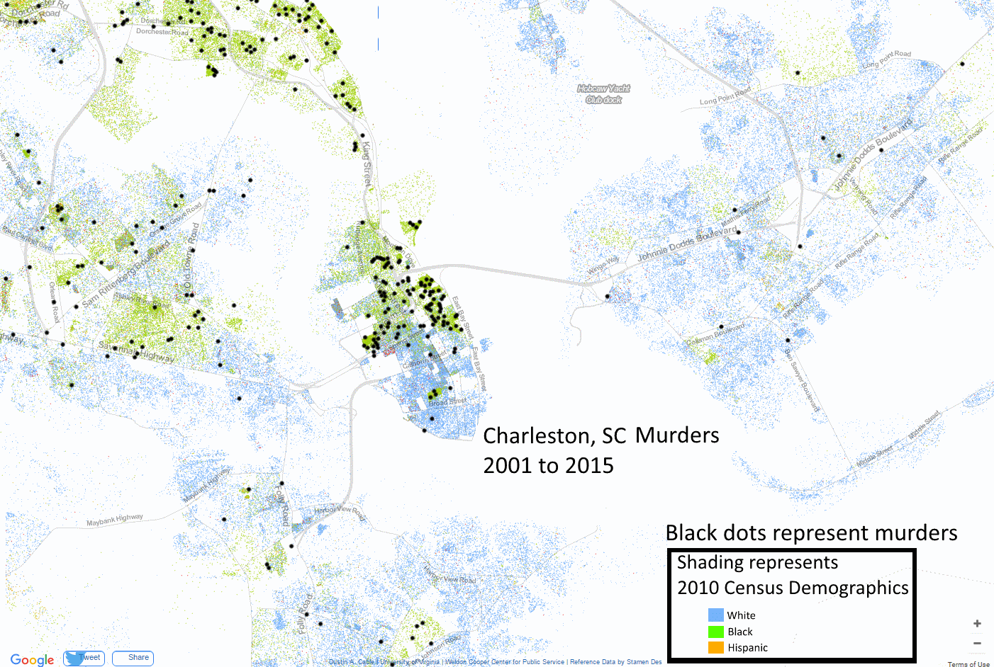
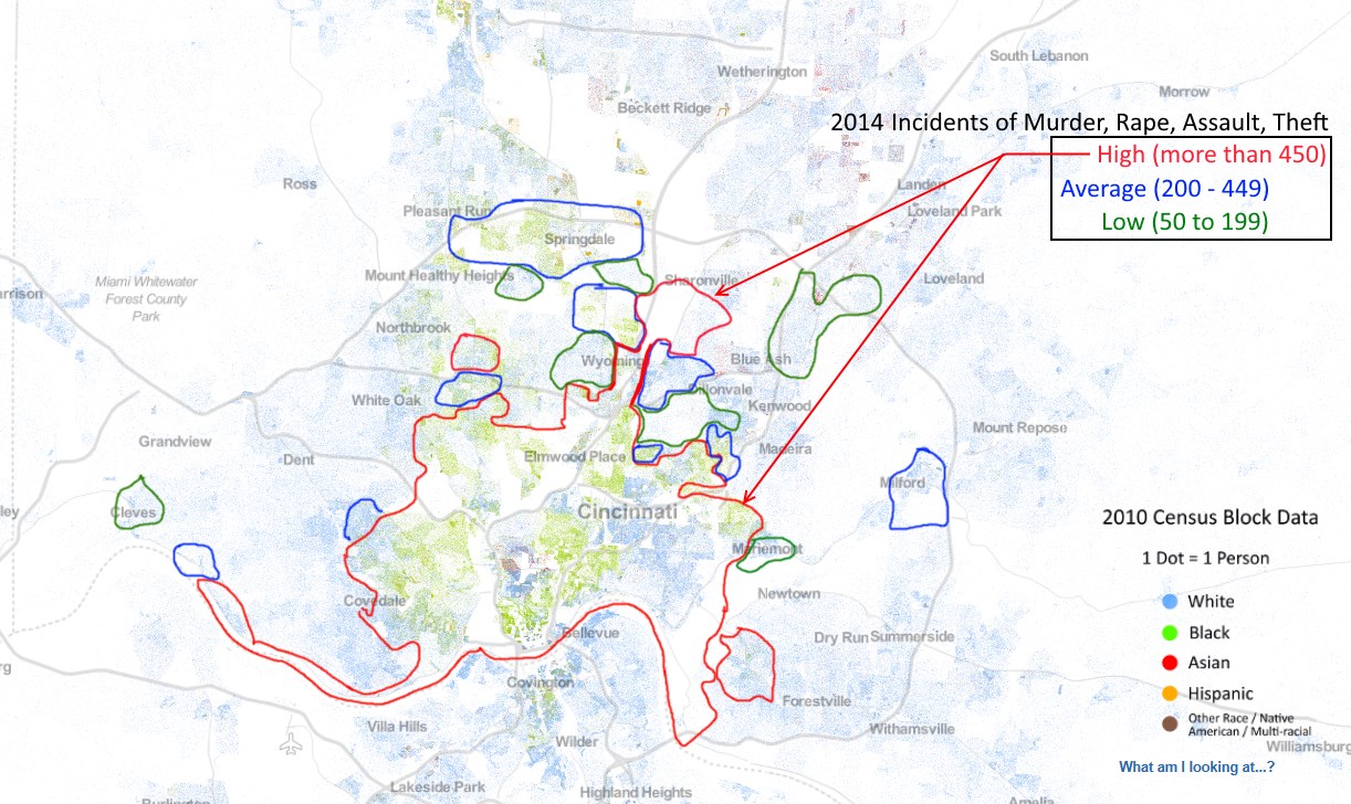
I've created over a dozen 'murder maps' by obtaining crime data from munincipal sources or city newspapers; and overlaying that data upon the Racial Dot Map.
For the maps below, the dots (regardless of their color or size) represent Murders; and the background shading represents demographics, with
• blue representing white people (includes those of semitic origin)
• green shading represents black people
• orange shading represents Hispanics.
Chicago
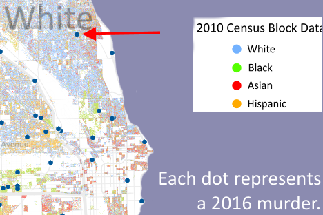
As bad as the data looks, it's worse than you think. Most murders in white neigh-borhoods, too, were done by blacks. One incident affected me, personally. See the red arrow at right. The victim was a 22 year old white male who was a family friend of my coworker. When I brought up black crime to him; he told me the following story, and began to sob:
"He was killed for his iPhone. It was terrible. His fiance's birthday was the next day. And a jewelry store nearby said he had come in every day during the week to find her the perfect gift."
Pittsburgh crime data
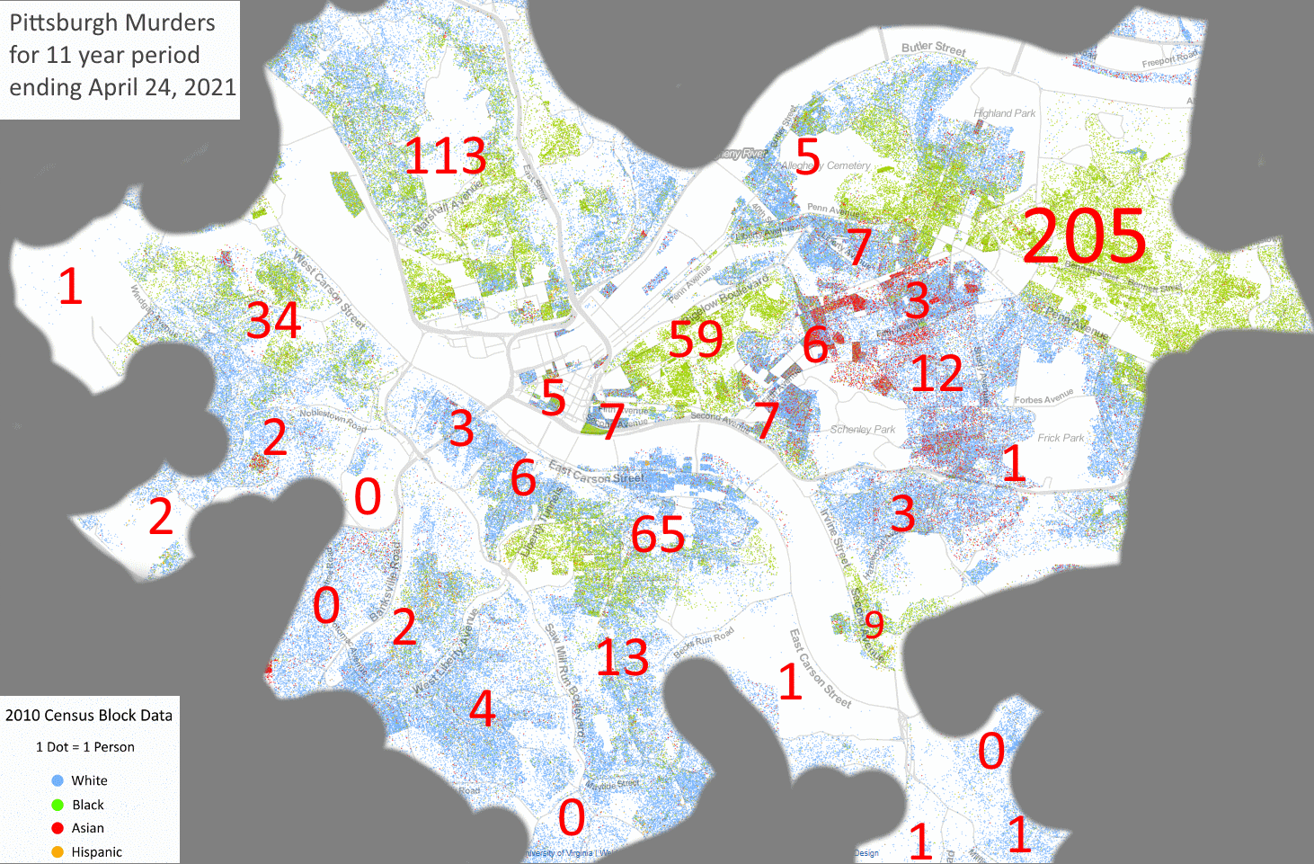
My apologies for such inconsistent formatting; each map was hand made at different points in time; and naturally I tried to improve them over time.